Design as a Competitive Moat
In the digital economy, your interface is the sole point of contact between your operational capability and the prospective customer. According to extensive studies in cognitive psychology, users form a definitive visual impression of a website within approximately 50 milliseconds of landing on the page. In this fraction of a second, the brain processes layout, hierarchy, color balance, and visual noise, forming an immediate emotional benchmark for quality. This first impression dictates whether the user continues down the conversion funnel or exits to a competitor, making design the ultimate competitive moat.
A high-end design shifts the conversation from price competition to value alignment. When a digital interface looks mass-produced, templated, or visually cluttered, it signals operational mediocrity. Conversely, an interface that uses structured grids, customized typography, and sophisticated styling acts as a visual guarantee of quality. In luxury and premium markets, where buyer intent is highly selective, design is a critical trust indicator. When a client encounters an environment that feels bespoke, their perceived risk drops significantly, paving the way for high-value interactions.
The return on investment (ROI) of premium design is highly quantifiable. Industry data indicates that every pound invested in professional user experience (UX) architecture generates a compounded return, driven by lower user acquisition costs and increased retention. While direct tactics like headline modifications and button positioning can elevate conversions (as highlighted in our CRO Playbook), a premium brand design system provides the psychological trust foundation that makes those calls-to-action effective. To maximize these conversion returns, a brand must align aesthetic authority with structured landing page optimization, a concept we explore deeply in our guide to landing page optimization.
Ultimately, treating design as a secondary cosmetic detail is a major operational error. A premium interface is a functional business asset that drives customer behavior, protects profit margins, and establishes market authority. By investing in design as a primary competitive moat, you build a digital presence that is hard for competitors to replicate and is optimized to turn anonymous visitors into highly profitable clients.
Creating a Premium Visual Design System
Constructing a luxury brand online requires a visual design system that communicates stability, sophistication, and meticulous care. Unlike standard consumer websites that rely on bright colors and busy layouts, premium interfaces achieve impact through restraint. The design system must be built on a mathematical foundation of grids, an elegant typographic scale, and a sophisticated color scheme that projects authority. Every design asset, from small UI buttons to large background wrappers, must follow this cohesive visual logic.
Color harmony is the foundation of luxury design systems. A dark, futuristic aesthetic (often utilizing deep, dark greys such as #0b0b0c and #121214 instead of pure, flat blacks) creates a rich visual canvas. This dark backdrop is paired with low-saturation metallic accents, such as muted gold (#f5c242) or copper, which are reserved strictly for high-priority interactive components like primary buttons or key category labels. This high-contrast, limited color palette prevents visual clutter, allowing the user's eye to immediately focus on the most important information.
To add texture and physical depth to dark layouts, we implement glassmorphism layers. By combining slight transparency with background blur filters, we create a layered workspace where elements appear to float over the background grid. This approach gives structural elements a glass-like look, adding spatial depth without relying on heavy graphic files that slow down page loads. When combined with custom typography — pairing a sophisticated serif font for headings to show brand heritage with a geometric sans-serif for body copy to show modern capability — the interface feels balanced, precise, and highly professional.
UX Architecture: Designing for Cognitive Flow
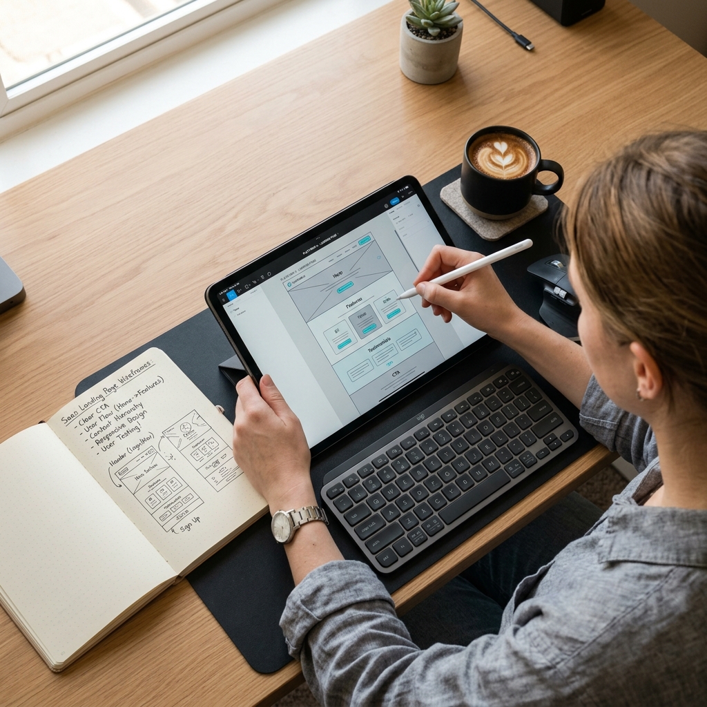
A premium visual system is only as good as the navigation flow beneath it. In luxury design, the primary goal of user experience architecture is to reduce cognitive load — the amount of mental effort required to process the page and find information. High-end web design should feel effortless. The layout must guide users through a clear narrative flow, making the journey to key pages feel natural and intuitive rather than forced.
Reducing cognitive load requires structured layout patterns. Information must be organized in a clear, scannable hierarchy that uses whitespace as a functional element. Instead of crowding the page with multiple columns, icons, and banners, premium design uses empty space to highlight key content. This deliberate spacing gives the layout breathing room and communicates confidence. By grouping related items logically and using distinct visual paths, you help users navigate the site with minimal friction.
Navigating a luxury site should feel invisible. This is achieved using a persistent, semi-transparent header that stays at the top of the page, clear breadcrumbs, and clean footer link systems. Interactive components should only appear when the user needs them. For example, a search panel should expand smoothly on click rather than cluttering the header, and mobile menus should open with simple sliding panels. By keeping navigation clean and focused, you keep the user in a state of frictionless flow, which directly boosts conversion rates. At RR IT Zone, our dedicated UX & development services are built around this philosophy, creating custom digital systems that guide high-value visitors to clear points of contact.
Designing for cognitive flow also means removing any elements that disrupt the user journey. Pop-ups, auto-playing videos, and flashing banners have no place in a premium experience. Instead, we use gentle visual transitions, clean content grids, and clear call-to-actions. When the interface respects the user's attention and time, it builds deep brand trust, converting casual browsers into committed clients.
Motion Design & Micro-Animations
Motion design is the glue that connects visual aesthetics to interactive usability. In luxury digital environments, movement is not used for decoration; it is used to provide feedback and guide attention. When a user hovers over a menu link, clicks a button, or scrolls down a page, subtle motion confirms that the system is responsive, interactive, and alive. This immediate feedback builds a sense of high-performance quality.
The key to premium motion design is subtlety and natural timing. Default linear animations feel mechanical and cheap. Instead, we use custom cubic-bezier timing curves that mimic physical weight and momentum. This timing curve starts fast and slows down gradually, creating a polished, natural transition. Hover states should be gentle: a button color shifting slightly, a card border glowing softly, or an arrow icon shifting a few pixels to the right. These micro-interactions show attention to detail without distracting the user from the content.
On-scroll animations are another effective way to guide attention. As the user scrolls, text blocks and images should fade and slide into view smoothly. This dynamic rendering keeps the user engaged, increasing average page dwell time by up to 25%. However, these animations must be implemented with restraint. If elements spin, slide from opposite directions, or move too fast, they create visual noise and distract from the brand message. Motion should always serve the content, guiding the user's eyes toward key calls-to-action.
Brand Authority and Credibility Signalling
Establishing authority is crucial when selling high-ticket services or luxury products. In the digital space, trust is built through credibility signals. A premium website must present strong evidence of stability, industry leadership, and exceptional delivery. This is achieved by combining customized, original media assets with a polished brand voice and well-designed social proof sections.
Generic stock photography is a major trust killer for premium brands. When visitors see a generic team photo or a common business scene, they immediately recognize it as unoriginal, which weakens brand credibility. A luxury brand must use high-quality, customized imagery, such as professional photography, clean product renders, or custom vector graphics. Every image must fit the brand's color palette and visual guidelines. If stock imagery is necessary, it must be carefully edited and color-graded to match the site's dark, futuristic aesthetic.
Copywriting is equally important for brand authority. The voice of your brand should match your premium visuals. Elegant, sophisticated design combined with low-effort, hyperactive copy destroys trust. The messaging must be precise, clear, and confident. Avoid buzzwords and focus on sharing clear, value-driven facts that demonstrate your expertise. Every headline, paragraph, and button label should sound authoritative, respectful, and clear.
Finally, social proof should be placed where it has the most impact. Instead of hiding client testimonials on a separate page, place them near key interaction points, such as checkout forms or primary inquiry buttons. Sharing concise quotes from notable clients or linking to detailed case studies provides the trust validation required to convert premium visitors.
Designing Responsive Layouts for Mobile Luxury
With over 62% of global web traffic originating from mobile devices, the mobile layout cannot be an afterthought. In luxury branding, the mobile interface must deliver the same premium experience as the desktop version. This requires a mobile-first design approach that focuses on smooth navigation, readable typography, and clean, responsive layouts optimized for touch interaction.
Designing for mobile requires careful attention to spacing and proportion. Desktop grids must collapse into clean, vertical structures without crowding elements. Typography should scale dynamically using modern CSS sizing rules to ensure readability on small screens without breaking layout balance. This ensures that headers look proportionate, whether viewed on a compact mobile screen or a large desktop monitor. Additionally, margin and padding scales must be adjusted to keep the layouts clean and spacious on smaller viewports.
Interactive touch targets are critical for mobile usability. Buttons and links must be large enough to prevent accidental clicks, especially for users navigating with one hand. We ensure all tap targets are at least 44×44 pixels, in line with modern usability standards. Placing key actions within easy reach of the thumb — such as using a sticky bottom navigation bar or a floating inquiry button — significantly improves mobile conversion rates. Optimizing these touchpoints is key to recovering lost revenue, a theme we expand on in our comprehensive CRO Playbook.
Accessibility (a11y) in Premium Design
Inclusivity is a core pillar of premium digital design. A luxury brand should provide a flawless experience to every visitor, regardless of physical or cognitive ability. Designing for accessibility ensures that your site is usable by everyone, which demonstrates respect for your audience and improves your search engine performance.
Maintaining proper color contrast is one of the biggest challenges in dark mode design. To comply with WCAG 2.1 AA guidelines, body copy must maintain a contrast ratio of at least 4.5:1 against the background. Using high-quality neutral tones (like #e2e8f0 on a #0b0b0c background) rather than stark pure white on pure black provides excellent readability and reduces eye strain. Standardize these colors across your stylesheet to keep the user experience consistent.
All interactive elements, including menus, buttons, and forms, must be fully navigable using a keyboard. This means focus states should be styled clearly so keyboard users can see where they are on the page. Additionally, use semantic HTML tags (like <header>, <nav>, <main>, and <footer>) and proper ARIA labels. This structured markup makes it easy for screen readers to interpret and navigate your content, ensuring a smooth experience for all users.
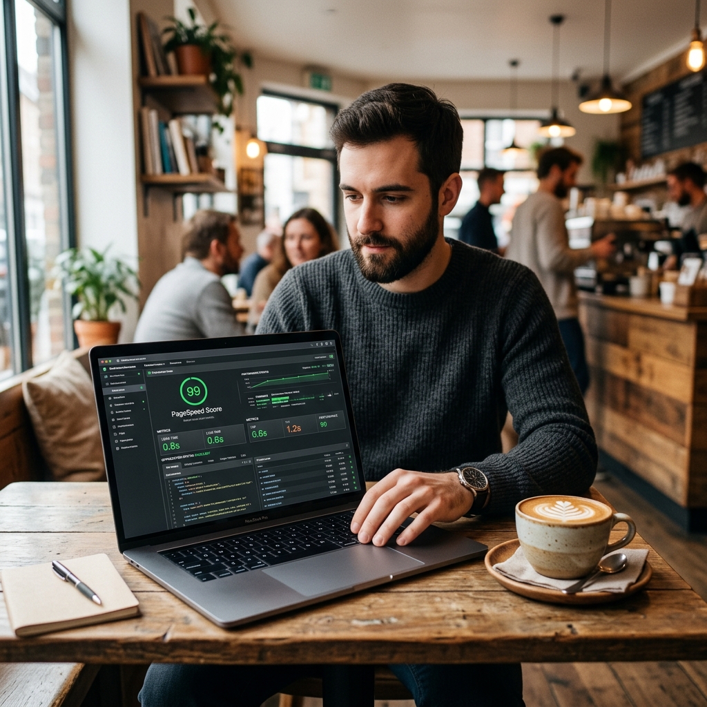
Page Speed & Design Balancing Act
A beautiful website is useless if users bounce before it loads. In premium web design, there is a constant balance between rich visuals and page performance. Luxury designs often use large images, video backgrounds, and interactive scripts, which can slow down load times if not optimized. To keep users engaged, the site must load almost instantly, combining premium aesthetics with fast performance.
The first step in visual optimization is using vector SVGs for all icons, logos, and simple illustrations. SVGs look sharp on high-density Retina displays and take up very little code. For photos and complex graphics, use modern formats like WebP or AVIF. Compressing images to 75-80% quality reduces file sizes significantly with no visible loss in quality. Use responsive image attributes to serve the right size to each device, and apply lazy loading so below-the-fold assets only load when they are needed.
Writing clean, semantic CSS and HTML is crucial for page speed. Avoid heavy CSS frameworks that add bloated code, and write custom, lightweight styles instead. Defer non-critical scripts so they do not block the page from rendering, and use native browser features for animations instead of large external libraries. By optimizing your code and asset delivery, you can achieve load times under one second. For a step-by-step methodology on technical site speed, consult our Page Speed Optimization Guide to achieve perfect scores.
Frequently Asked Questions
Visual design is the first touchpoint of trust. According to research from Stanford University, 75% of web users judge a company's credibility based on its website design. A cluttered, outdated, or generic interface signals carelessness and lack of resource, prompting users to exit immediately. Conversely, a clean, intentional, high-end visual design system with balanced whitespace, premium typography, and subtle micro-interactions communicates professional capability, brand stability, and meticulous attention to detail.
A premium digital branding system is built on restraint, cohesion, and sensory depth. It requires a refined color harmony (often a sophisticated dark palette paired with muted gold or copper accents), custom typography that establishes clear hierarchical flow, glassmorphism layers (frosted transparency using CSS backdrop-filters to create dimensional depth), and original, high-resolution imagery. Consistency across all pages is crucial, as any visual discrepancy instantly breaks the premium brand experience.
Micro-animations provide subtle visual feedback to user inputs, confirming that the system is responsive and interactive. When done correctly, they reduce cognitive load and guide the user's attention through a page. Studies show that implementing polished micro-animations and smooth scroll transitions can increase average page dwell time by up to 25%. They make the interface feel alive and premium, encouraging users to scroll further and engage with the content longer.
Cognitive flow in UX refers to the ease with which a user processes information and navigates an interface to achieve their goal. It is about minimizing cognitive friction — the mental effort required to understand layout, find navigation, or process a form. A high-converting premium site uses clear information hierarchy, intuitive menu structures (like sticky headers and breadcrumbs), and high-contrast call-to-actions. By keeping the user in a state of frictionless flow, you significantly increase the probability of action and conversion.
Accessibility and luxury design share a core philosophy: delivering a flawless, bespoke experience to every individual. High-end design should never compromise on inclusivity. True luxury means ensuring contrast ratios meet WCAG 2.1 AA standards (at least 4.5:1), keyboard navigation is fully supported for interactive elements, and HTML is semantic and annotated with ARIA markup. Designing an accessible interface proves that a brand respects its audience and prioritizes usability as much as aesthetics.
Balancing luxury aesthetics with fast load times is achieved through modern front-end engineering. First, replace heavy bitmap graphics with clean vector SVGs where possible. Second, apply modern image compression formats (such as WebP or AVIF) at optimal ratios, and implement responsive image tags. Third, write semantic, lightweight HTML and CSS without bloated frameworks. Fast pages not only keep users from bouncing but also act as a crucial ranking signal for search engine visibility.
Upgrade Your Digital Systems with RR IT Zone
Our technical architects and automation experts will audit your current site performance, SEO structures, and operational processes to deliver a clear, customized execution plan. We've built dozens of authority engines and automation setups that drive real, measurable ROI for global enterprises.